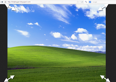
A constant question is how to make the background image of the blog always fill the entire screen regardless of the resolution of the monitor. And that is when we put a background image as measured by our monitor forgetting that there are actually monitors of all resolutions, very small and very large. So if we put an image according to our screen, there will be someone with a bigger monitor that surely will not see the whole picture or it will be repeated, and in this case, using very small monitors, the image will be seen incomplete.
Here I will talk about two solutions for this, one is using CSS3, and another is using jQuery. With either of these two, we'll make the background image of the page to fill the entire screen regardless of the resolution of it.
The first option is using CSS3, the advantage with this method is that we do not overload the blog with scripts, we use only the background-size property that is responsible for doing what we want.
The disadvantage is that this property is supported only by modern browsers, so in the case of Internet Explorer, it will only be seen for version 9 and above, in other browsers there shouldn't be any problem.
The method is very simple, just go to Template - Edit HTML, locate the background that is within body { and replace it with this:
It would look something like this:
With this method we will use jQuery with BackStretch plugin, the advantage is that it works in all browsers, including IE7 and above. And if you already use jQuery, you don't have to worry about the loading time of your blog, because the plugin is actually small.
To use this method in your blog, go to Template - Edit HTML and before </head> paste this script:
Put the URL of the image where indicated and ready.
As you can see both options are easy to apply, each with its pros and cons, but the result is the same, stretching the background image to fit the screen of any monitor regardless of the resolution of it.
Remember that in the case of jQuery method, you should verify that you are not using Mootools or Scriptaculous, and if you already have it, you will have to implement some changes in the script to make it compatible. And if you already use jQuery remember having only one version - the last one.
Here I will talk about two solutions for this, one is using CSS3, and another is using jQuery. With either of these two, we'll make the background image of the page to fill the entire screen regardless of the resolution of it.
CSS3
The first option is using CSS3, the advantage with this method is that we do not overload the blog with scripts, we use only the background-size property that is responsible for doing what we want.
The disadvantage is that this property is supported only by modern browsers, so in the case of Internet Explorer, it will only be seen for version 9 and above, in other browsers there shouldn't be any problem.
The method is very simple, just go to Template - Edit HTML, locate the background that is within body { and replace it with this:
background: url(Image URL) no-repeat center center fixed;Note: to find the body { tag, click anywhere inside the code area then press the CTRL + F keys and paste it inside the search box. If you can't find it, remove the space between "body" and "{" then search again.
background-size: cover;
It would look something like this:
body {Just put the URL of the image and that's it.
background: url(URL of the image) no-repeat center center fixed;
background-size: cover;
margin:0;
}
jQuery
With this method we will use jQuery with BackStretch plugin, the advantage is that it works in all browsers, including IE7 and above. And if you already use jQuery, you don't have to worry about the loading time of your blog, because the plugin is actually small.
To use this method in your blog, go to Template - Edit HTML and before </head> paste this script:
<script src='http://ajax.googleapis.com/ajax/libs/jquery/1.10.2/jquery.min.js' type='text/javascript'/>
<script type='text/javascript'>
//<![CDATA[
/*
* jQuery Backstretch
* Version 1.2.8
* http://srobbin.com/jquery-plugins/jquery-backstretch/
* Add a dynamically-resized background image to the page
* Copyright (c) 2012 Scott Robbin (srobbin.com)
* Licensed under the MIT license
* https://raw.github.com/srobbin/jquery-backstretch/master/LICENSE.txt
*/
;(function(a){a.backstretch=function(p,b,l){function s(){if(p){var b;0==c.length?c=a("<div />").attr("id","backstretch").css({left:0,top:0,position:m?"fixed":"absolute",overflow:"hidden",zIndex:-999999,margin:0,padding:0,height:"100%",width:"100%"}):c.find("img").addClass("deleteable");b=a("<img />").css({position:"absolute",display:"none",margin:0,padding:0,border:"none",zIndex:-999999,maxWidth:"none"}).bind("load",function(d){var b=a(this),e;b.css({width:"auto",height:"auto"});e=this.width||a(d.target).width();d=this.height||a(d.target).height();n=e/d;q();b.fadeIn(g.speed,function(){c.find(".deleteable").remove();"function"==typeof l&&l()})}).appendTo(c);0==a("body #backstretch").length&&(0===a(window).scrollTop()&&window.scrollTo(0,0),a("body").append(c));c.data("settings",g);b.attr("src",p);a(window).unbind("resize.backstretch").bind("resize.backstretch",function(){"onorientationchange"in window&&window.pageYOffset===0&&window.scrollTo(0,1);q()})}}function q(){try{j={left:0,top:0},rootWidth=h=o.width(),rootHeight=r?window.innerHeight:o.height(),f=h/n,f>=rootHeight?(k=(f-rootHeight)/2,g.centeredY&&(j.top="-"+k+"px")):(f=rootHeight,h=f*n,k=(h-rootWidth)/2,g.centeredX&&(j.left="-"+k+"px")),c.css({width:rootWidth,height:rootHeight}).find("img:not(.deleteable)").css({width:h,height:f}).css(j)}catch(a){}}var t={centeredX:!0,centeredY:!0,speed:0},c=a("#backstretch"),g=c.data("settings")||t;c.data("settings");var o,m,r,n,h,f,k,j;b&&"object"==typeof b&&a.extend(g,b);b&&"function"==typeof b&&(l=b);a(document).ready(function(){var b=window,d=navigator.userAgent,c=navigator.platform,e=d.match(/AppleWebKit\/([0-9]+)/),e=!!e&&e[1],f=d.match(/Fennec\/([0-9]+)/),f=!!f&&f[1],g=d.match(/Opera Mobi\/([0-9]+)/),h=!!g&&g[1],i=d.match(/MSIE ([0-9]+)/),i=!!i&&i[1];o=(m=!((-1<c.indexOf("iPhone")||-1<c.indexOf("iPad")||-1<c.indexOf("iPod"))&&e&&534>e||b.operamini&&"[object OperaMini]"==={}.toString.call(b.operamini)||g&&7458>h||-1<d.indexOf("Android")&&e&&533>e||f&&6>f||"palmGetResource"in window&&e&&534>e||-1<d.indexOf("MeeGo")&&-1<d.indexOf("NokiaBrowser/8.5.0")||i&&6>=i))?a(window):a(document);r=m&&window.innerHeight;s()});return this}})(jQuery);
//]]>
</script>
<script>
$.backstretch("URL of the image");
</script>
Put the URL of the image where indicated and ready.
As you can see both options are easy to apply, each with its pros and cons, but the result is the same, stretching the background image to fit the screen of any monitor regardless of the resolution of it.
Remember that in the case of jQuery method, you should verify that you are not using Mootools or Scriptaculous, and if you already have it, you will have to implement some changes in the script to make it compatible. And if you already use jQuery remember having only one version - the last one.


thank you sir ....
The CSS3 method changed the font and color of my posts and gadgets. How can I fix this?
Your template is unable to read the CSS declarations because you added a second curly bracket right after body {. Remove it and it should return to normal.
Awesome! Thanks a lot!
My body tag does not look like the example above. it looks like this:
----------------------------------------------- */
body {
font: $(body.font);
color: $(body.text.color);
background: $(body.background);
padding: 0 $(content.shadow.spread) $(content.shadow.spread) $(content.shadow.spread);
$(body.background.override)
}
html body $(page.width.selector) {
min-width: 0;
max-width: 100%;
width: $(page.width);
}
--------------------------------------------------------
So I have no clue what to remove and what to add.
enlighten me.
t